As many people notice on a daily basis, the speed of the internet and the capacity of computers to put fancy videos and images on the screen has exploded the last decade. But at the same time with the introduction of smart phones, netbooks and public wifi a lot of people are using limited devices to surf overcrowded bandwith space in the hope of finding some information. Or even in developing countries where connection speeds over 1 Mbit are rare or not available.
Lately I have been surfing a lot of those connections with my Asus EEE pc and that’s when you notice how annoying it can be some websites don’t take this group of consumers in thought when they design their websites. Some simple tips to avoid common pitfalls. This will increase the happiness visitors feel when visiting your site and might just make it more preferable than one of your competitors.

Imagine sitting in a sweaty 32 C internet cafe in the heartlands of Peru. 26 computers in as much square meters with half of them blaring counterstrike action. The owner advertises with 512 Kpbs superfastcool speed (shared by all computers). The browser is Internet Explorer 5.5 unpatched and you only want to check your mail and search for a nearby vegetarian restaurant. This takes about a hour since websites are clogged with unneeded crap, intro’s, google maps and more. Even worse the browser crashes four times because it cannot handle the memory ubsurp and the computer is nearly dying. What kind of site would you go for? *
*true story
Compliant, scalable makeup
HTML and CSS are there for a reason. Compliant HTML serves many purposes, one of them to be able to make sites scale to the size of the clients screen. A lot of websites today don’t make good use of this by hardcoding for instance the size of the site. This makes sidebars and other information drop from the screen. Remember that a most netbooks only have 1024×678. Use CSS to set relative sizes and test how it looks on smaller screens.
I just want to login!
Frontpage don’ts
– Don’t use introduction pages like it’s 1999. Most people know how to surf the web, most people know why they come to your site and what they are looking for. Just show me the information and let me do where I came from thankyouverymuch. A total waste of valuable bandwidth and time.
– Flash and video content. Do not load them onto the first page people get to see. On a weak processor it gets horribly slow and in 99% of the cases (until visiting Youtube or so) I don’t want to see it! The new couchsurfing site is a good bad example. Only load these kind of content when as user more or less expects this. This way there is a choice if the current situation is good enough to even want to go there.
– Welcome layovers. See intro’s. Argh. Usually it’s a kind of lightbox / flash banner that slows everything to a grind, then displaying something stupid like ‘register’ (which I hardly ever want) or any other generic message distracting me, my connection and my few resources from getting where I want. Personally I don’t open sites who do this.
Cut back on Javascript
Don’t do client side Javascript what you can do server side, like loading images, setting to client settings like country or language prefences and pretty much everything else if it can be avoided. Clients are notoriously unreliable in what they claim to be, besides all the scripting eats at the capacity of slow machines. They might not even load scripts well or at all.
Embedded video, live map backdrop makes my computer walk like a dinosaur.
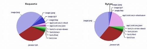
Content breakdown of couchsurfing frontpage
Don’t use AJAX for everything!
AJAX is the deity of Web 2.0. and while it can be handy and -yes- enables a new generation of sites but it also uses a lot of processing power and bandwidth. One of the most annoying things are AJAX-compliant site without any progress bars or indications something might be loading. That’s of no issue on your 2-seconds load time but if you have to wait 20 seconds for every page it becomes confusing. Did I click it? Is my connection still up?
Another annoying thing is waiting for a site to fully load before coming useable. For instance the new notifications bar on Facebook. It shows a number ( I got a life! ), but before being able to see all the new love I have to wait for the damn thing to load all the way, if it ever finishes loading.
Think if you really need to use AJAX or could withstand with a simple link or any other simpler solution.
Automatic dynamic refreshing?
An increasing amount of sites poll frequently if any new updates occurred on the page. Like Facebook, twitter and a lot of news sites. This is particularly worrisome on slow connections. As a consumer I have to choice which sites to leave open in the task bar for later use and I usually close sites who use this technique. That means if you are not the current CEO of Twitter I might forget about your site or spend less time on it because I notice my other queries are slowing down. Think if your information is so urgent I would like to offer bandwidth to check often.
Lean and mean output
Increasingly, website software systems like blog software, CMS software and so on tend to clog the output, especially if a lot of plugins are used. The reasoning appears to be ‘better loaded in vain than causing a rare error somewhere’. Of course, this way the amount of data needed to travel increases, making it slow. And even worse all the scripts firing up while maybe not even being used gobble must-needed memory.
Often check your sites source output for unneeded stuff and remove it. Disable or even remove plugins when they are not used.
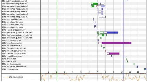
I’m not loading one site I’m loading 32 sites! ( Zoetemeernieuws.nl which often kills my connection )
External sources
This is not always to be avoided, but be aware of how many site requests your page needs before it’s loaded. Think about querying google for it’s analytics or ad-words, a sub-domain for images, or – god forbid – content hosted externally showing on your site. Every request takes ages and usually I can write down the site names before any of those DNS-requests gets through. Try to limit as much as possible to your site only. Once the bits start flowing, maybe the whole thing is there a bit faster.
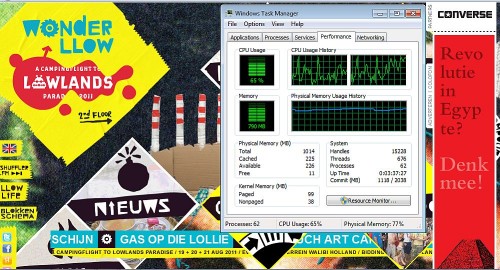
Lowlands.nl: I’ll make everything dynamic and dance. Shut up, I kill you!
Checklist
– Frequently check your code for compliance to standards
– Only use rich-content (flash,video,lot’s o images etc ) when the user can expect this and try to limit it when possible
– Keep Javascript, Ajax and other consuming techniques to a minimum
– Check your own site on a slow connection and on a small screen.
– First load main content, then load sidebars.
– Limit waste like unneeded content, scripts and loading from external sources.
– Webpagetest is quite handy. So is the W3 validator
Basszje has been doing this for about ten years so maybe he’ll call himself an expert in his vain days. By no means is this page checked or optimized for any of above hints
Do you have stuff you will strongly recommend? The comments are open!


